When it comes to web design and digital marketing, having an effective logo can go a long way.
To show the effectiveness of a logo, try to think of a brand in your head. Are you picturing that brand’s logo?
In recent years some of the top global brands have made pretty drastic changes to their logo design. This new wave of logo design is what experts are calling Debrading.
In this article we will discuss this new phenomenon and some case studies of brands who have minimized their logo and why they did so.
Table of content
What is logo debranding?
Logo Debranding is simplifying your logo design. Removing any unnecessary elements to keep the logo as simple as possible while keeping brand recognition.
A great example of this is how the Pringles logo has kept its imagery, while removing all detail and styling. Pringles have shown that the new era of branding is putting clarity and functionality over eye-catching and artistic.

Why are brands simplifying their logo design?
It seems strange that brands seem to be going backwards in terms of logo design. However, the answer to why they are doing so is quite simple and straightforward.
Where are logos most frequently seen in 2020? On Mobile devices and desktop. For this reason brands are designing their logos to be mobile optimized.
Minimal detail in logo design works better when being used for social media profile pictures or mobile app images.
Warner Bros have ditched their iconic wide gold / blue logo for one that is blue / white and more narrow. This is with the sole purpose of fitting petter on profile pictures and their new app.
In the Case of BT Media you can see how they have made their logo in the same shape as a Facebook, Instagram and Twitter profile picture.


Types of debranding
When talking about debranding there are 3 different roads you can go down. Each will have different results and are suited to different sized businesses.
Transition to generic logo design
Generic branding is the phenomenon that we are seeing with major global brands. Perfect for developing a brand’s digital platforms.
Another reason for this method of debranding may be because they want to remove something from the brand perception.
You may have noticed that Kentucky Fried Chicken has switched to KFC as their primary name. Can this have something to do with the negative perception fried food has on people’s health? No one can say for sure but I think it’s safe to assume it had something to do with it.
What is Decorporatising branding
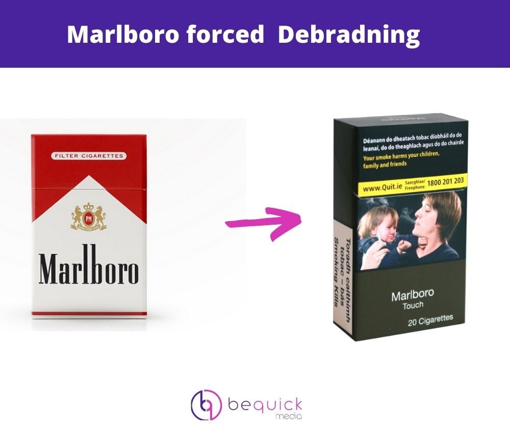
Decorparising is when a brand removes branding from its product. This can often be a legislative move, like cigarettes companies were forced to do. Gone are the days of the iconic marlboro red / white and camel design.
This was done as a way to deter consumers from smoking and making smoking less sexy and cool. The goal of rebranding was to make smoking seem dangerous and out of style.
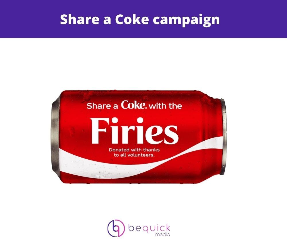
Decorperatising can be used with brands that have so much brand recognition that changes to the branding can be done temporarily as promotional events. Coca Cola did this when they removed their logo in place with “Share with a friend” or a person’s name.
Sports teams often do this as well to celebrate anniversaries by wearing old jerseys that have little to no branding that the current jerseys have.
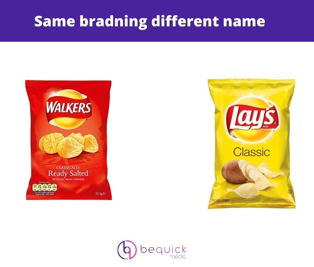
Modern debranding design
Modern branding is not what it sounds like. It is the process of removing a brand’s name from packaging but keeping the logo and changing the name.
You may have noticed modern debradning design if you have traveled to America and thought about picking up some Walkers crisps. You would have noticed despite having identical logo and branding, the name on the packet says Lay’s
What does Logo debranding mean for SMEs and start ups.
For small and new businesses, a logo change isn’t as big a deal than a major global brand with an iconic logo such as Starbucks or mastercard. Debranding really only affects mature brands.
What these major brands can teach small businesses is that this is the trend for the future. When designing your logo you should take your website design, social media profile pictures and mobile applications as the primary factor when designing your brand’s logo.
Does debranding always work
The simple answer to this is no. Debranding isn’t loved by everyone. The reason some logos work is because of how eye catching they are and how they stick in your mind.
For some the new corporate modernisation design, that big brands love, is moving away from art and culture. If not done right, you are taking away from your brand’s story. For some brands simplifying their logo will never work. McDonalds for example, the golden arches are just too iconic to touch. But then again, many people would have thought the same for Warner bros.
Learn more about branding and logo design
If you are looking to build an online brand to be competitive in the modern digital world, drop a message below and a member of our team will be in touch for a free consultation.